A large and growing trove of patient, clinical, and organizational data is collected as a part of the “Help Desk” program at Durham’s Lincoln Community Health Center. Help Desk is a group of student volunteers who connect with patients over the phone and help them navigate to community resources (like food assistance programs, legal aid, or employment centers). Data-driven approaches to identifying service gaps, understanding the patient population, and uncovering unseen trends are important for improving patient health and advocating for the necessity of these resources. Disparities in food security, economic stability, education, neighborhood and physical environment, community and social context, and access to the healthcare system are crucial social determinants of health, which studies indicate account for nearly 70% of all health outcomes.
This project introduced some techniques and best practices of data visualization with a focus on clear, thoughtful, and impactful presentation—a crucial part of any project working with data. Discussions and activities advanced a perspective on data visualization as a form of visual storytelling and creating meaning, as opposed to just “making numbers pretty.” Participants were then asked to comment on the effectiveness of several created examples. In the second part of the Expedition, students were given data from Help Desk and were walked through the process of visualization, from conception to design, to answer a relevant research question of their own regarding Help Desk and the social determinants of health. Visualizations were created in Tableau, a common and useful software in health and public policy domains.
Guiding Questions
- Why visualize? What is the point of visualization?
- What are the implicit and explicit narratives of real-world data visualizations?
- What contexts are important for understanding our Help Desk data?
- What are necessary, appropriate, and responsible questions to ask given our data?
- What type of visualization would best convey the information we have (i.e. bar graph, histogram, scatterplot)?
The Dataset
Data were obtained from PRAPARE screenings conducted by case managers at Lincoln as well as from Help Desk volunteers speaking with patients over the phone. A variety of questions about patient needs and demographics, call outreach and outcomes, and community-based organization service and utility can be investigated. Participants were given a dataset containing 700 de-identified patient records with 1,122 variables, the number of variables slightly pared down from the original dataset. The full codebook was included for reference.
Lab Sessions
In the first session, participants were introduced to the fundamentals of data visualization as storytelling and sense-making. They watched Hans Rosling’s “200 Countries, 200 Years, 4 Minutes” video and discussed the implicit and explicit narratives told in visualization. Then, after an overview of HIPAA and data privacy by Connor, Tyler went through a live demonstration of Tableau, creating a basic bar graph, and led the participants through a critique of five visualizations created ahead of time using Help Desk data. As homework, participants were asked to download Tableau, load the dataset, and familiarize themselves with the interface and codebook.
In the second session, participants were split into two groups, Connor and Tyler guiding one each through the process of data visualization from start to finish.
Each group focused on a different question:
- Which food-related CBOs were the most referred to? Which food-related CBOs were the most “successful”?
- What demographic factors are most associated with self-reported food need?
From here, participants were asked to discuss which variables would be most pertinent to answering their respective question, then which type of visualization would convey information the best, and finally whether there were other techniques (color, order, text) that could be useful.
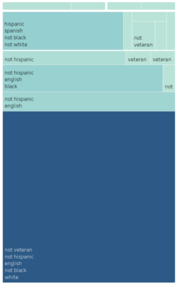
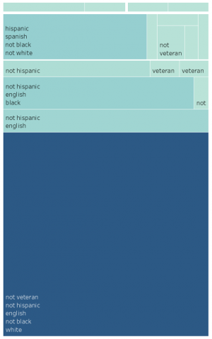
The groups reconvened to share their preliminary visualizations and give each other feedback. They are presented here, without some of the necessary context, labels, explanations needed to make them interpretable, due to the time constraints.


Downloads
Data Expedition Lesson Plan.docx


