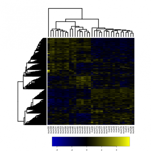
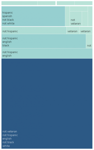
The aim of this Data Expedition was for students to learn hands-on data visualization techniques using a variety of data types. Students first discussed how data visualization is useful, and tips to make graphs both visually appealing and easy to understand.
Graduate Students: Jenn Coughlan, Ryan Campbell
Course: Biology 490s – Methods in Comp Bio & Genomics
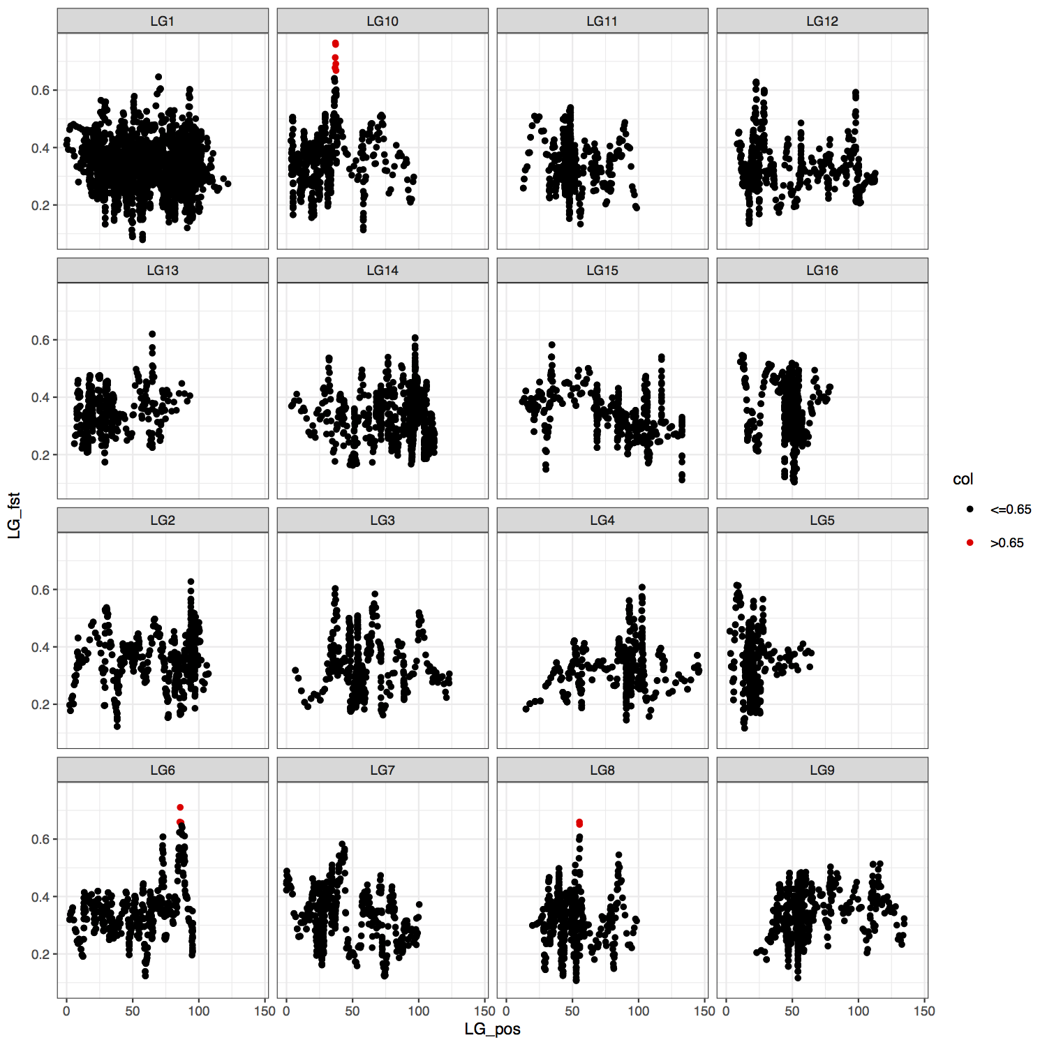
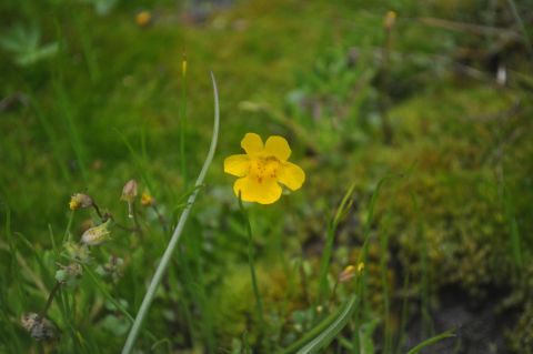
Over two 70-minute class periods, the students worked through two tutorials; the first introducing them to the basics of ggplot2, a data visualization package in the free statistical interface R. Students were then given a homework assignment to visualize a simple genotype-phenotype dataset, ‘Coughlan_inversiongenopheno.csv’. In the second class, we began by discussing the homework assignment, thinking of challenges and next steps. Students were then given a much more complicated dataset, involving reduced representation whole genome data from the wildflower Senecio (from Roda et al. 2017, dataset ‘Fst_BSA_wLinkagegrp.csv’). Students used this data to associate survival with allele frequencies across different habitats to determine regions of the genome which are associated with adaptation to edaphic conditions.
Download the course slides (PDF).

Contact
C. Ryan Campbell
Biology
c.ryan.campbell@duke.edu


